In our survey, we’ve collected information around the kind of health and sanitation practices in place at different tourism businesses in and around Kathmandu. In this report, we use statistical clustering techniques to segment businesses based on their health and sanitation preparedness, and use maps to spatially represent this information. Since our respondents are only a small subset of tourism businesses in Kathmandu, we also want to overlay OSM data and see if any patterns emerge.
DATA
Data used in this report comes from our ongoing C2M2 Tourism Businesses’ Survey, which contains responses from 112 tourism business owners from different parts of Nepal. While the survey was first targeted for business owners in Kathmandu, we have also received information from businesses in the cities of Pokhara and Chitwan respectively.
Data pre-processing
After directly downloading the raw dataset from our Kobo servers, the only data preprocessing step that has been carried out is the appending of latitude and longitude information for businesses who responded to our our survey. While we did ask tourism business owners to provide geographical coordinates, the question was optional. As a result, only around 50% of businesses provided this information. For the remaining businesses, this information was filled in by KLL’s geospatial team, after thoroughly cross-referencing metadata (name, location, email, etc.) provided by businesses with existing OSM data. Presently, only three businesses don’t have geospatial coordinates associated with them because the provided metadata wasn’t clear or sufficient enough to pinpoint these businesses locations.
VARIABLES
For the purposes of our analysis, we will be segmenting businesses based on their response to the question: “Which of the following health and sanitation measures did your business employ during the pandemic?”. Respondents could choose one of many options, which have been stored in the following columns as binary (flag) variables:
- sntzrs: Placed sanitizers at prominent locations
- empl_trained: Trained our employees on HHS (health, hygiene, and sanitation)
- thrml_scrn: Placed thermal screening and disinfection
- soc_dist: Maintained social distancing at our business premises
- cshless: Introduced/implemented cashless payments
- nobufft: Discontinued buffet services (applicable for hotels and restaurants only)
- c19mrktg: Added COVID-19 friendly marketing messages
- outsrc: Outsourced certain services like order management, delivery, etc.
- other Other
- none: None
In addition, the following additional attributes will all be used outside the clustering exercise to learn more about the nature of these clusters:
- id: A unique identifier for each of our responses
- perm_closed: A flag variable that indicates whether a business has had to permanently shut down because of the pandemic.
- type: The type of business (can be one of Hotel, Restaurant and Bar, Travel and Tour Operator, Handicraft, Rafting, Trekking, Mountaineering, Shop/Merchandise, Other)
- X_m_coodinates_latitude: Latitude information for the business. This was added during the data pre-processing step.
- X_m_coodinates_longitude: Longitude information for the business. This was added during the data pre-processing step.
Note: The raw data used for this analysis can be downloaded here.
Methodology
The following flow chart outlines the spes taken in our analysis.
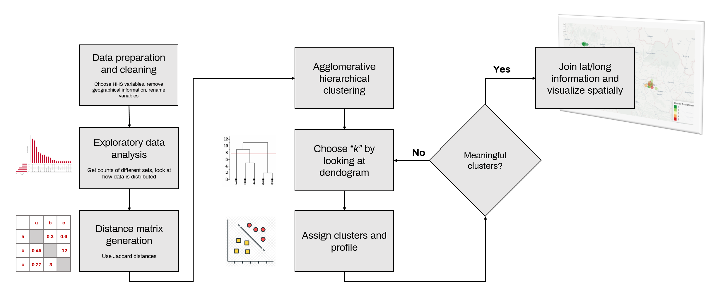
1. Data preparation and cleaning
Here, we will subset the raw data to only include the variables of interest for our analysis, we will also rename variables.
2. Exploratory data analysis
Here we look how the data is distributed. It will provide insight into things like commonly employed health and sanitation measures, and popular combinations of HHS practices, etc.
3. Agglomerative hierarchical clustering
We’ve chosen agglomerative hierarchical clustering, which, in its bottom-up approach, begins with assigning every data point into their respective clusters, and then grouping similar clusters together with every next iteration.
Rationale
Since the data is relatively small in size the hierarchical clustering based approach’s algorithmic complexity of O(N^2) will not be of huge consequence for the purposes of our analysis. The method also does not require us to pre-specify the number of clusters we need, and provides a way to visually represent clustering results (through what is called a dendogram), both of which will be helpful in making decisions around the number of clusters we should allocate. The number of clusters will be decided after looking at the dendogram generated through the clustering exercise.
4. Cluster assignment and profiling
After the clustering is complete, and we’ve chosen “k”, we now proceed to assign individual businesses their respective clusters. We then use a simple EDA exercise to understand the nature of businesses falling in each of these clusters. We do this by looking and within-cluster proportions of businesses that use a specific health and sanitation measure. For each cluster, we also look at the distribution of businesses by the type of business (hotel, restaurant, etc.)
5. Spatially visualizing businesses by cluster type
Finally, we then spatially visualize businesses based ion the cluster they belong to, to see if there are any spatial patterns that can emerge from the dataset.
Key decision points and callouts
Excluding permanently closed businesses
For the purposes of our analysis, we have only included businesses that haven’t permanently shut down. Given the analysis’ goals of categorizing hotels into red, yellow, and green based on the health, hygiene, and sanitation practices they follow
Jaccard distance for measuring similarity
The classification of observations into groups requires some methods for computing the distance or the (dis)similarity between each pair of observations. The result of this computation is known as a dissimilarity or distance matrix. Since we’re dealing with binary variables, we cannot use traditionally used measures of distance such as Euclidean distance, as they also consider joint absences (i.e. businesses that do not use sanitizers, or businesses that do not use thermal screening, are also considered as similar). We do not want businesses to be considered similar based on choices they haven’t made. To deal with this, we’ve used Jaccard distance. More here.
Number of clusters
These have been selected by first visually observing and cutting horizontal lines through the dendogram at different positions, and then looking at profiles for different numbers of clusters, and how data is distributed among them.
Cluster linkage methods
To identify the appropriate cluster linkage method (our goal is to use a method that provides a stronger cluster structure), we’ve have used the method that produces the highest agglomerative coefficient.
Analysis with code
For the purposes of brevity and legibility, only important sections of the code has been shown in this document. The remaining ciode is hidden. To view the full code used for the analysis, you can review the raw RMarkdown file here.
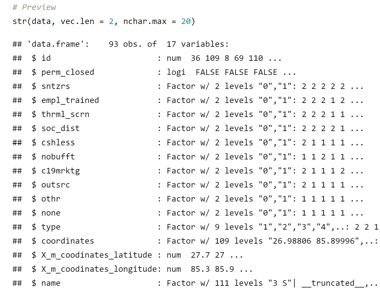
Before we begin, let us look at the data we will be working with.
Exploratory data analysis
The package UpsetR, which provides intersection totals for a combination of binary variables can be used to quickly scan through data.
# Subset only HHS columns
subs <- data %>% select(c(colnames(data)[3:12]))
# Function to convert all factors to numeric
asNumeric <- function(x) as.numeric(as.character(x))
factorsNumeric <- function(d) modifyList(
  d,
  lapply(d[, sapply(d, is.factor)],asNumeric)
)
# Visualize using UpsetR
upset(factorsNumeric(subs),
      order.by="freq",
      main.bar.color = "#c3092b",
      sets.bar.color = "#c3092b",
      group.by = "degree"
)
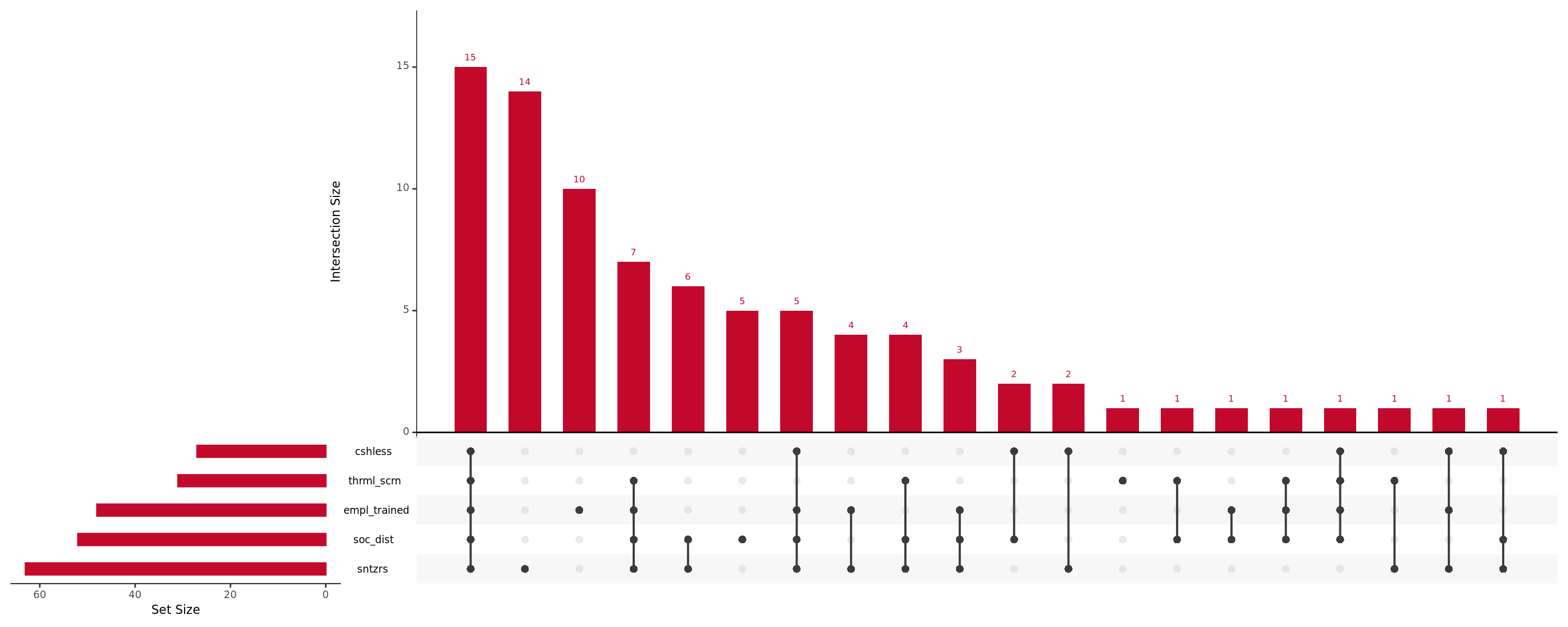
As we can see, a good chunk of businesses were quick to adapt and introduce all forms of health, hygiene, and safety best practices. However, there appears to be a significant proportion of businesses who did the bare mininum (introduce sanitiziers, or train employees). Will these patterns be reflected in our segmentation exercise? Let’s find out.
Agglomerative hierarchical clustering
Let’s begin by computing the distance matrix based on the “jaccard” (dis)similarity metric.
# Subset only relevant columns
measures_var <- renamed_cols[3:12]
df <- data %>%
  select(all_of(measures_var))
# Convert columns to numeric values
indx <- sapply(df, is.factor)
df[indx] <- lapply(
  df[indx],
  function(x) as.numeric(as.character(x))
)
# Compute distance matrix based on "jaccard" distance
dist.mat<-vegdist(
  df,
  method="jaccard",
  binary = T
)
Before we perform the clustering exercise, we will start first by looking for the appropriate cluster linkage method we should use for our analysis. For this, we use the agnes method available in the cluster package to calculate the agglomerative coefficients(ac) for different methods.
# Calculate agglomerative coefficients
# for different cluster linkage methods
m <- c( "average", "single", "complete", "ward")
names(m) <- c( "average", "single", "complete", "ward")
ac <- function(x) {
  agnes(subs, method = x)$ac
}
map_dbl(m, ac)

Based on the results above, let’s choose the “ward” method as the agglomerative coefficient is the highest. Now then, let’s go ahead and perform the actual clustering exercise.
# Perform and plot clustering results
clust.res<-hclust(dist.mat, method = "ward.D")
plot(clust.res, hang=-1, cex=0.8)
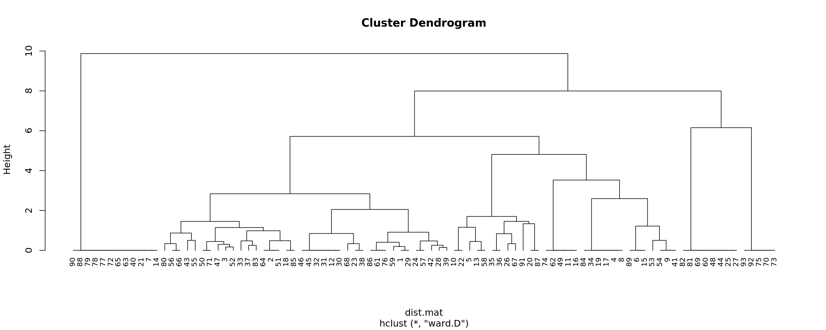
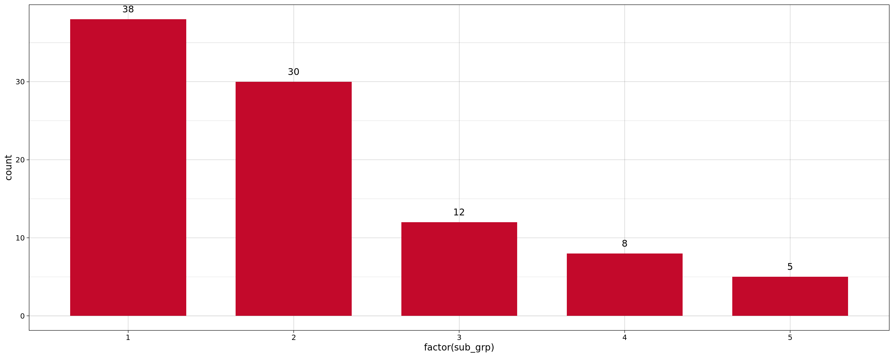
After looking at results for different values of k (outside this document), we found that using k=5 yields clusters that have reasonable within group similarity, and between-group dissimilarity.
Cluster assignment and profiling
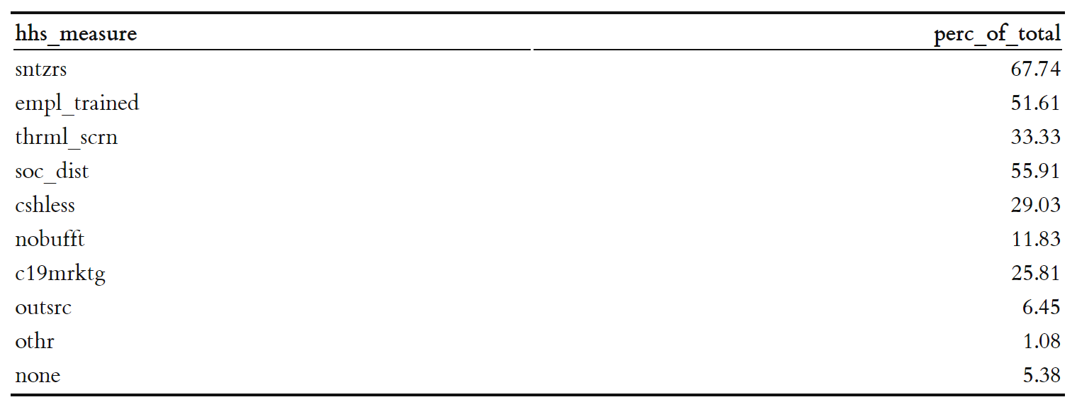
Before we begin the profiling exercise, let’s look at the prevalance of different health and sanitation measures across oursurvey respondents. Table below shows the proportion of businesses that employ different health and sanitation measures:
totals <- df %>% summarise(
  sntzrs=round(sum(as.numeric(as.character(sntzrs)))/n()*100, 2),
  empl_trained=round(sum(as.numeric(as.character(empl_trained)))/n()*100, 2),
  thrml_scrn=round(sum(as.numeric(as.character(thrml_scrn)))/n()*100, 2),
  soc_dist=round(sum(as.numeric(as.character(soc_dist)))/n()*100, 2),
  cshless=round(sum(as.numeric(as.character(cshless)))/n()*100, 2),
  nobufft=round(sum(as.numeric(as.character(nobufft)))/n()*100, 2),
  c19mrktg=round(sum(as.numeric(as.character(c19mrktg)))/n()*100, 2),
  outsrc=round(sum(as.numeric(as.character(outsrc)))/n()*100, 2),
  othr=round(sum(as.numeric(as.character(othr)))/n()*100, 2),
  none=round(sum(as.numeric(as.character(none)))/n()*100, 2)
)
knitr::kable(gather(totals, hhs_measure, perc_of_total, sntzrs:none, factor_key=TRUE))
Now then , let’s go ahead and assign clusters back to our observations using k=5. We will also go ahead and look at how our data is distributed amongst these clusters using a simple bar chart.
sub_grp <- cutree(clust.res, k = 5)
data <- cbind(data, sub_grp)
# Visualize
ggplot(
  data,
  aes(x=factor(sub_grp))
  ) +
  geom_bar(
  stat="count",
  width=0.7,
  fill="#c3092b") +
  theme_linedraw() +
  geom_text(
    stat='count',
    aes(label=..count..),
    vjust=-1
  )
Understanding cluster characteristics
Looking at within cluster proportions of different health, hygiene, and sanitation measures adopted by businesses falling in these cluster can reveal interesting insights around how the data is currently being grouped by our clustering exercise.
cluster_profiles <- data %>%
  group_by(sub_grp) %>%
  summarise(
    count = n(),
    sntzrs=round(sum(as.numeric(as.character(sntzrs)))/n()*100, 2),
    empl_trained=round(sum(as.numeric(as.character(empl_trained)))/n()*100, 2),
    thrml_scrn=round(sum(as.numeric(as.character(thrml_scrn)))/n()*100, 2),
    soc_dist=round(sum(as.numeric(as.character(soc_dist)))/n()*100, 2),
    cshless=round(sum(as.numeric(as.character(cshless)))/n()*100, 2),
    nobufft=round(sum(as.numeric(as.character(nobufft)))/n()*100, 2),
    c19mrktg=round(sum(as.numeric(as.character(c19mrktg)))/n()*100, 2),
    outsrc=round(sum(as.numeric(as.character(outsrc)))/n()*100, 2),
    othr=round(sum(as.numeric(as.character(othr)))/n()*100, 2),
    none=round(sum(as.numeric(as.character(none)))/n()*100, 2)
)
knitr::kable(cluster_profiles)
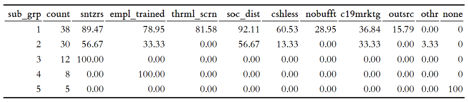
A few observations:
- Businesses falling in Cluster 1 seem to be the most responsible when it comes to HHS measure adoption, with a majority of these businesses adopting more than one method in ensuring health, hygiene and safety measures. Highlighting these businesses work could definitely help nudge other businesses towards adopting HHS measures.
- Businesses falling to Cluster 5 had not adopted any health, hygiene, and sanitation measures at the time of taking this survey. Reaching out to these businesses could reveal more insight into why this is happening, and help generate insights around hurdles for businesses to adopt HHS measures.
- Businesses falling to Cluster 3 and Cluster 4 don’t seem to be far away from their Cluster 5 counterparts, having done only the bare minimum needed for ensuring HHS safety, either through the use of hand sanitizers in business premises, or through employee traininbg on HHS best practices.
- The behaviour of businesses in Cluster 2 is a bit unclear, while these businesses have sought to adopt more than one measure, it appears there is room to do more. Once again, reaching out to these businesses could provide an oppportunity for government and non-government stakeholders to learn about the different challenges and hurdles surrounding HHS measures adoption in tourism businesses.
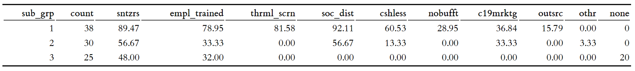
Given these observations, we can observe three distinctive patterns for health, hygiene and sanitation practices emerging from our data. There is a group of businesses that have made little to no effort in adopting HHS measures follwoing the pandemic (clusters 3, 4,5). Then there is a group of responsible bunisesses, where many have adopted more than one HHS measures in response to the pandemic. Finally there is the in-between group (cluster 2). Let’s go ahead and regroup our clusters based on this pattern.
data$sub_grp <- ifelse(data$sub_grp == 4, 3, ifelse(data$sub_grp==5, 3, data$sub_grp))
cluster_profiles <- data %>%
  group_by(sub_grp) %>%
  summarise(
    count = n(),
    sntzrs=round(sum(as.numeric(as.character(sntzrs)))/n()*100, 2),
    empl_trained=round(sum(as.numeric(as.character(empl_trained)))/n()*100, 2),
    thrml_scrn=round(sum(as.numeric(as.character(thrml_scrn)))/n()*100, 2),
    soc_dist=round(sum(as.numeric(as.character(soc_dist)))/n()*100, 2),
    cshless=round(sum(as.numeric(as.character(cshless)))/n()*100, 2),
    nobufft=round(sum(as.numeric(as.character(nobufft)))/n()*100, 2),
    c19mrktg=round(sum(as.numeric(as.character(c19mrktg)))/n()*100, 2),
    outsrc=round(sum(as.numeric(as.character(outsrc)))/n()*100, 2),
    othr=round(sum(as.numeric(as.character(othr)))/n()*100, 2),
    none=round(sum(as.numeric(as.character(none)))/n()*100, 2)
)

knitr::kable(cluster_profiles)
At the same time, we also want to look at the distribution of businesses by type at the cluster level, as this could help reveal potential red flags. For example, a hotel business – where there is a relatively higer probability of person-to-person contact - falling into clusters 3, 4 or 5 would be a more serious issue than a travel and tour operator falling into these clusters. So let’s go ahead a visualize this information as well.
ggplot(
  data,
  aes(x=factor(type))
  ) +
  geom_bar(
  stat="count",
  width=0.7,
  fill="#c3092b") +
  geom_text(
    stat='count',
    aes(label=..count..),
    vjust=-1
  ) +
  facet_grid(sub_grp ~ .) +
  scale_x_discrete(
  breaks=1:9,
  labels=c(
    "Hotel",
    "Rest & B",
    "Trav. Tour",
    "Handicraft",
    "Rafting",
    "Trekking",
    "Mountnring",
    "Shop",
    "Other"
    )
  ) +
  theme_linedraw()
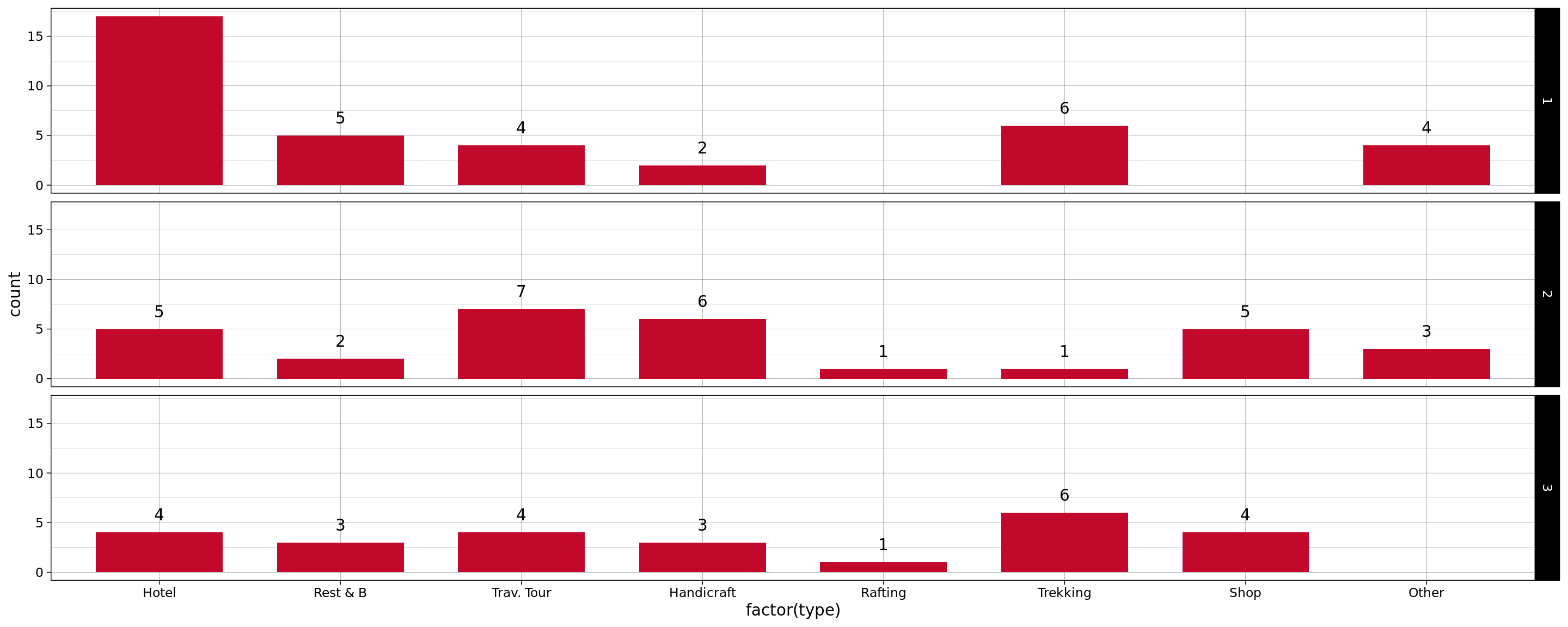
And indeed, 7 out of 25 businesses that fall in Clusers 3, 4 or 5 are hotels and restaurants. These businesses should be contacted immediately and provided with necessary assistance so that they can ensure better HHS measures for their customers.
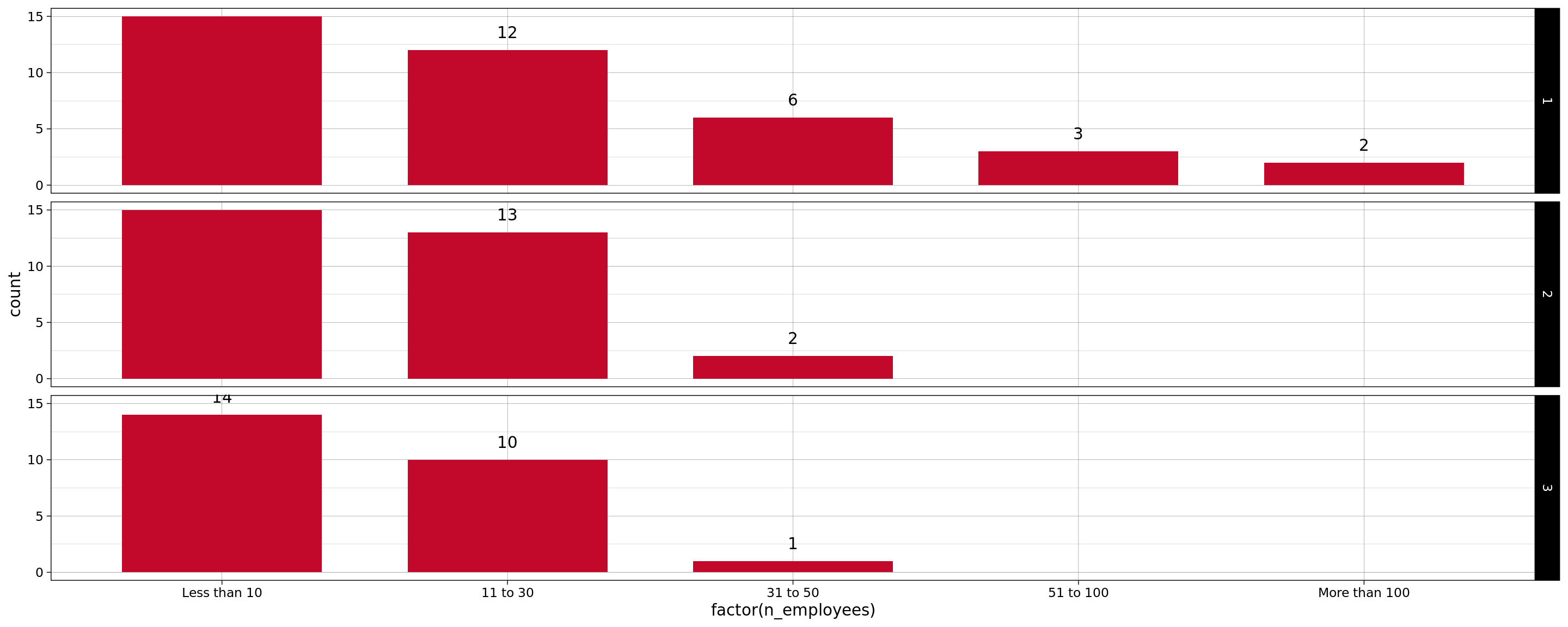
Similarly, let’s also look at the distribution of businesses by number of employees at the cluster level.
ggplot(
  data,
  aes(x=factor(n_employees))
  ) +
  geom_bar(
  stat="count",
  width=0.7,
  fill="#c3092b") +
  geom_text(
    stat='count',
    aes(label=..count..),
    vjust=-1
  ) +
  facet_grid(sub_grp ~ .) +
  scale_x_discrete(
  breaks=1:5,
  labels=c(
    "Less than 10",
    "11 to 30",
    "31 to 50",
    "51 to 100",
    "More than 100"
    )
  ) +
  theme_linedraw()
Spatially visualizing businesses by cluster type
Could HHS measure adoption be linked with where businesses are located? A map based visualization can help answer this question.
data$lat <-as.numeric(
  as.character(data$X_m_coodinates_latitude)
  )
data$lng <- as.numeric(
  as.character(data$X_m_coodinates_longitude)
)
# Some 3 businesses don't have
# coordinates, so lets exclude them
onlyLatLng <- data[!is.na(data$lat), ]
onlyLatLng <- data[!is.na(data$lng), ]
colors <- c("#1b9e77ff", "#d95f02ff", "#7570b3ff")
factpal <- colorFactor(colors, onlyLatLng$sub_grp)
leaflet(data = onlyLatLng, width = "75%") %>%
  addProviderTiles(providers$CartoDB.Positron) %>%
  addCircleMarkers(
    lng = ~lng,
    lat = ~lat,
    color = ~factpal(sub_grp),
    stroke = FALSE,
    fillOpacity = 0.5,
    label = ~name) %>%
  addLegend(
    "bottomright",
    pal = factpal,
    values = ~sub_grp,
    title = "Cluster Assignment",
    opacity = 1
  )
Businesses outside the valley appear to be doing better w.r.t HHS measures adoption. Most of the businesses who responded from the cities of Pokhara and Chitwan fall under Clusters 1 or 2. At this point, we can’t say if this is because buinesses these cities adopted HHS practices later (after learning from Kathmandu), because the domain they operate in require stricter HHS practices (most are hotels and restaurants), or because adopting HHS practices was more feasible. Further analysis can help us understand this phenomenon better.
Businesses in Thamel can learn from each other. There is a good mix of safe (cluster 1) and bare-minimum (cluster 3, 4) hotels in Thamel (zoom the map to the most densely populated region). This represent an opportunity for tourism stakeholders in Thamel to collaborate with safe businesses in training hotels with HHS measure adoption.
REFERENCES
- Hierarchical Clustering Analysis, https://uc-r.github.io/hc_clustering
- User Similarity with Binary Data in Python, https://towardsdatascience.com/user-similarity-with-binary-data-in-python-d15940a702fc
- Lex et. al, UpSet: Visualization of Intersecting Sets, IEEE Transactions on Visualization and Computer Graphics, 2014 https://sci.utah.edu/~vdl/papers/2014_infovis_upset.pdf